I’m back from the national WordPress conference in Nashville and excited to share the best takeaways directly with you!
Over the three years that I’ve attended national WordPress conferences, I’ve noticed that the trends that emerge during the conference affect my clients’ nonprofit websites throughout the year.
In January, I’ll write a in-depth trends report for my Quarterly Website Strategy Sessions clients, but you, dear SmartCause Digital reader, can check out the preview right now!
If you enjoy this preview, make sure you subscribe to SmartCause Digital email updates! I always give my email subscribers first access to awesome content.

Navigation Menus
If you’re struggling to organize your website’s navigation menu, here are a few useful options from nonprofit and government websites.
- Task
- Audience
- Cart sort
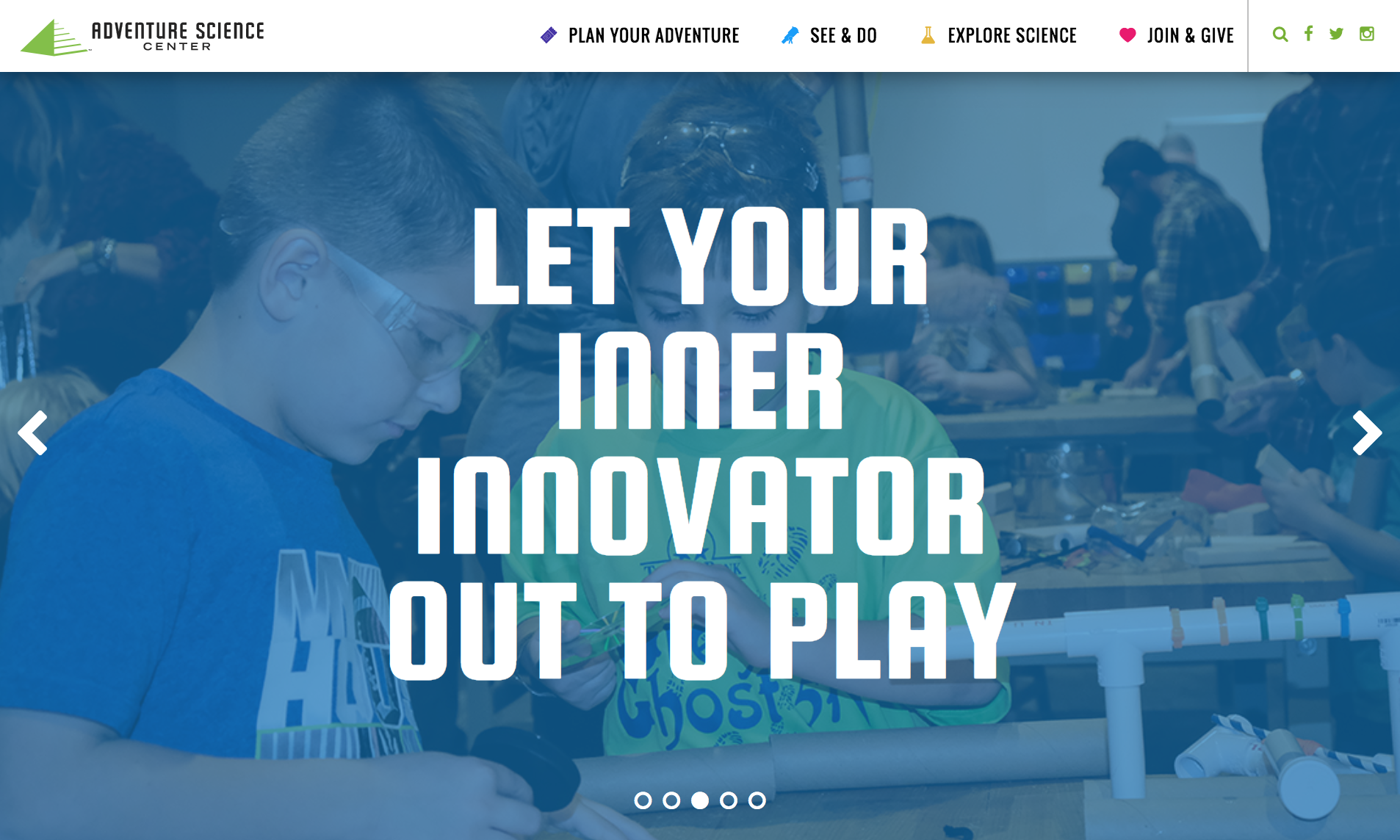
Nashville’s children’s museum (which my toddler greatly enjoyed) organizes their menu according to the various tasks that a website reader might want to accomplish.

Audience
Music City Center
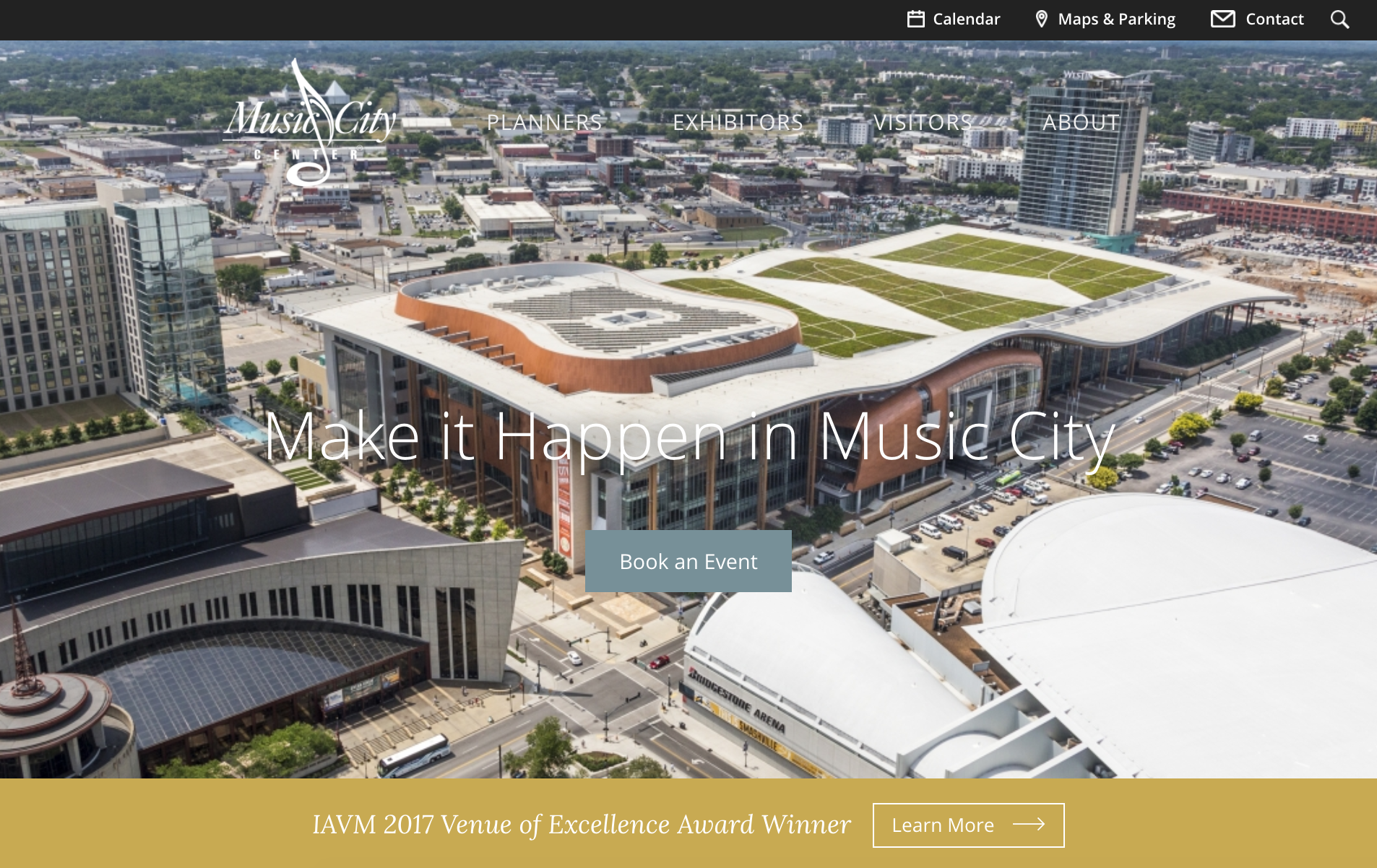
Nashville’s convention center organizes their navigation menu by target audience.

Card Sort
Project Learning Tree
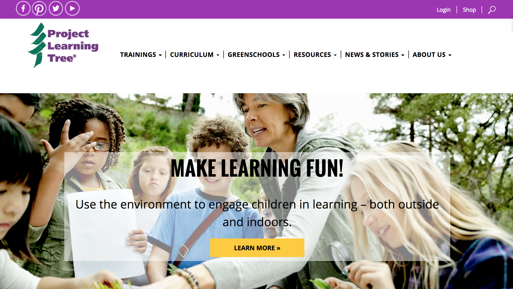
For SmartCause Digital Method client Project Learning Tree, I used a card sort that allowed target audience members to indicate how they would organize the navigation menu. The final result addresses the interest of various target audience groups, based on their card sort feedback.

Security
Whether your site uses WordPress or another system, you should play an active role in ensuring that proper security mechanisms are in place.
A few security items to get you started:
- HTTPS
- Double authentication for logins (example: password *AND* a code sent to your mobile phone)
- Regular, offsite backups
(You can read more about website security here: A Beginner’s Guide to Nonprofit Website Security)
(And if you’re not sure whether your website is secure, check out my Quarterly Website Strategy Session service. You’ll get my professional support for your website all year long!)
Accessibility
As a nonprofit website manager, you should strive to make your website accessible to all types of users, including peeps who might have issues with vision, mobility, comprehension, hearing, etc.
Here’s a couple of tools that I’m personally looking forward to using in the ongoing effort to make all nonprofit websites more accessible:
Training
Do you have a training resource on hand to help you and your staff learn how to manage your website?
Probably not, because most nonprofits don’t. But we all should!
Whenever I build a new website as part of the SmartCause Method, I lead a comprehensive training to help current staff understand how to update and manage the website. And because no one can remember everything and new staff come along all the time, I also provide written documentation and a recording of our training.
My goal is to empower my client to manage as much of the website as possible.
For your website, think about recording a quick screencast that shows how to update existing content, add new content, manage users, etc.
Remember…
If you enjoyed this preview, make sure you scroll down and enter your email address to subscribe to SmartCause Digital email updates! I always give my email subscribers first access to awesome content.

