I used to hate popups… until I used one on a nonprofit website and saw amazing results.
Let’s figure out what makes a great popup and how you can use one for your organization – the smart way.
Gallery of Awesome Nonprofit Popups
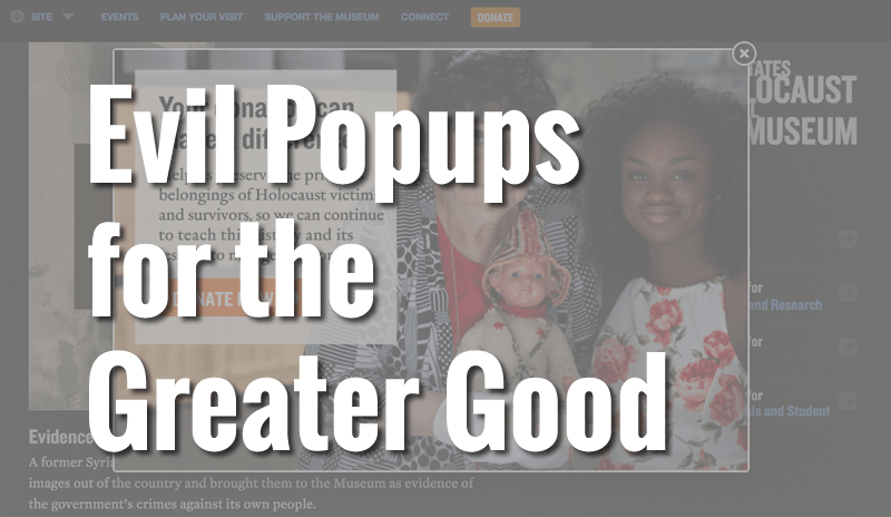
One of my all-time favorites. Great photo, relevant message, contrasting color on the button. (United States Holocaust Museum)
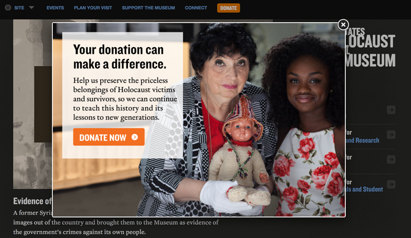
Compelling photo, targeted copy, contrasting color on the button. (The Humane Society)
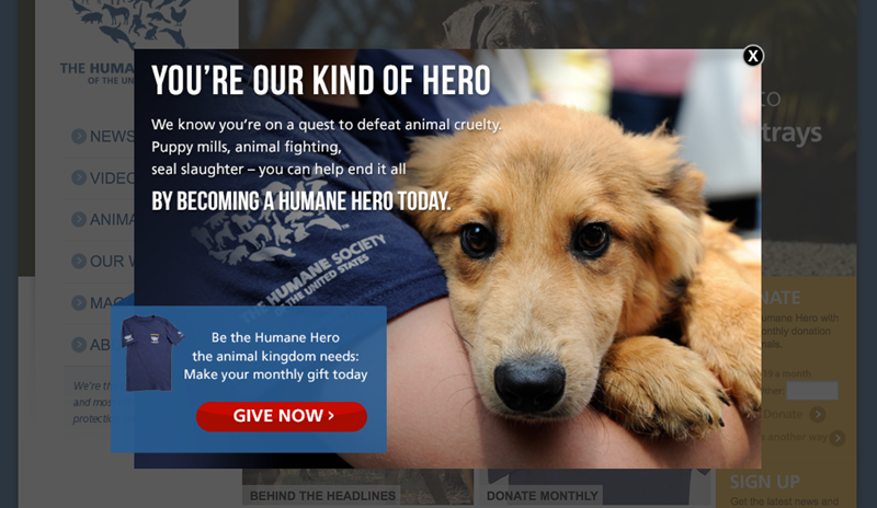
Great photo, email form embedded right into the popup, message tells me what to expect. (Accion Chicago)
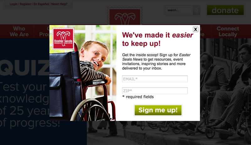
Email form embedded right into the popup, message tells me what to expect. (Easter Seals)
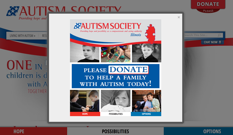
Clear call to action. Potential improvements: focus on one picture, use a contrasting color for the button. (Autism Society of Illinois)
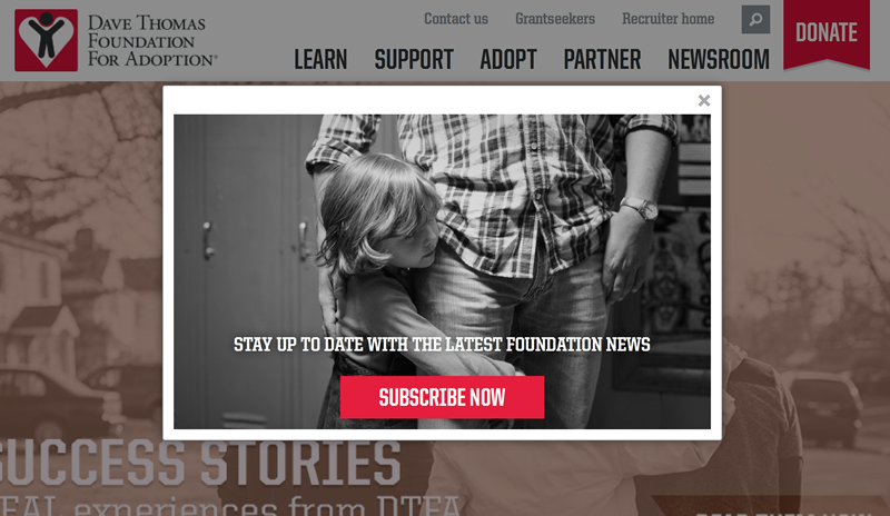
Great photo! Potential improvements: embed the form right into the popup, tell me what to expect from email. (Dave Thomas Foundation for Adoption)
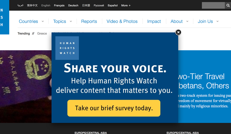
Bold colors with contrasting yellow button. Potential improvements: focus on a more compelling call to action or use more emotion text to entice me to complete the survey. (Human Rights Watch)
Why Some Popups are Evil
- They interrupt our experience.
Especially those popups that show up as soon as I arrive on a page. - They’re too aggressive.
Popups that appear on every single page as a try to navigate a site, I’m looking at you. - They have nothing to do with what WE want.
I’m reading an article about healthy eating, I’m not here to complete the survey.
Why Popups Get Amazing Results
- You can use them to accomplish a specific website goal,
like building up your email list or driving donations. - They focus attention to something important.
Use a popup to direct all of a reader’s attention to one specific action. - Sometimes we all need a little handholding or a little push.
I’m reading a website about healthy green smoothies and I’m enjoying the recipes so much it doesn’t occur to me to actively look for an email signup option. But if a popup appears that promises to deliver a free pack of 10 green smoothie recipes… I’ll probably say yes. I just needed a little push.
How to Use a Popup – the Smart Way
- Delay the launch.
Wait at least 10 – 15 seconds before you show a visitor a popup. This way you don’t interrupt the “getting to know you” stage and you end up showing the popup just to the most interested visitors. - Present a timely, compelling call to action.
Remember why she’s on your site in the first place – and appeal to her emotions. “For the puppies” or “for the kids”, not “for the survey”. - If your visitor dismisses the popup, don’t show it to her again for at least a week.
As we used to say growing up in Chicago, stop sweatin’ her! Respect her wishes, give her some space… and ask again later. - Use fundraising popups in December.
At the end of the year, people are coming to your site with the specific goal of making a donation. A popup is the most helpful thing you can do for your donor. - Disable popups on mobile devices.
Not all our mobile devices can handle popups… and not all popups can handle mobile devices. Save the headache and heartache and disable popups for your mobile visitors.
