What is a wireframe?
A wireframe represents the layout of a website without any design elements, such as colors, fonts or logos.
Why is a wireframe important?
A wireframe allows you and your team/boss/vendor to discuss the placement of major elements of the site and explore how specific functions will work without having to get into additional conversations about colors and logos. Your team will save valuable time and budget by discussing features and layout and editing the wireframe, rather than editing a final product. After the wireframe is complete, your designer and/or developer will use it as a base for the next phases of the website project.
We’re walking through a website wireframe, but you can wireframe almost any project including email newsletters, print brochures or specific pieces of a website such as a donation form or online donation process.
How can I make a wireframe?
There are many online tools available to use or try for free. Go Mockingbird is a good place to start for a simple project. If you have something a little more complex in mind, Balsamiq might be more your speed.
How can I make a [good] wireframe?
Now we’re getting to the good stuff…
You don’t need to be a designer or a developer; anyone can make a wireframe. Let’s walk through a wireframe process and review some important considerations.
Western website visitors tend to read websites in a Z pattern. They scan from the top left corner to the top right corner to the bottom left corner to the bottom right corner. The top corners of your wireframe should provide website visitors with an introduction to your nonprofit and easy-to-access useful links.
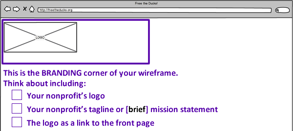
This is the Branding corner of your wireframe. Think about including: your nonprofit’s logo, your nonprofit’s tagline or [brief] mission statement and/or the logo as a link to the front page.
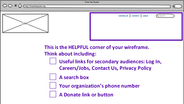
This is the Helpful corner of your wireframe. Think about including: useful links for secondary audiences including log in, careers / jobs, contact us or privacy policy pages, a search box, your organization’s phone number and/or a donate link or button.
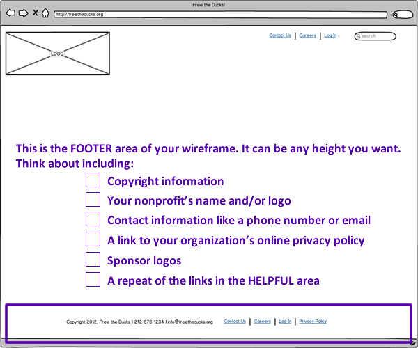
This is the footer area of your wireframe. Footers can be very slim with a single line or two of text or expanded in height to include lists of popular links. Think about including: copyright information, your nonprofit’s name and/or logo, contact information like a phone number or email address, a link to your organization’s online privacy policy, sponsor logos and/or a repeat of the links in the helpful area.
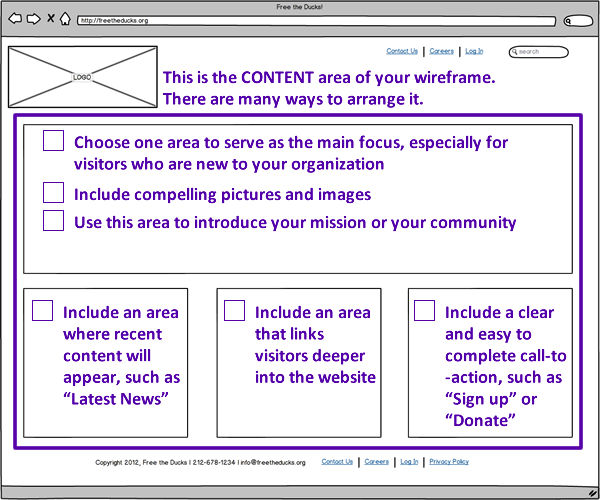
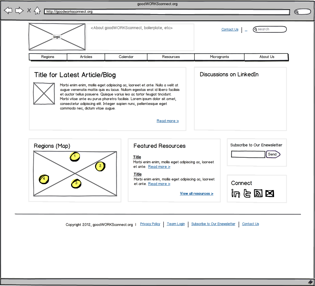
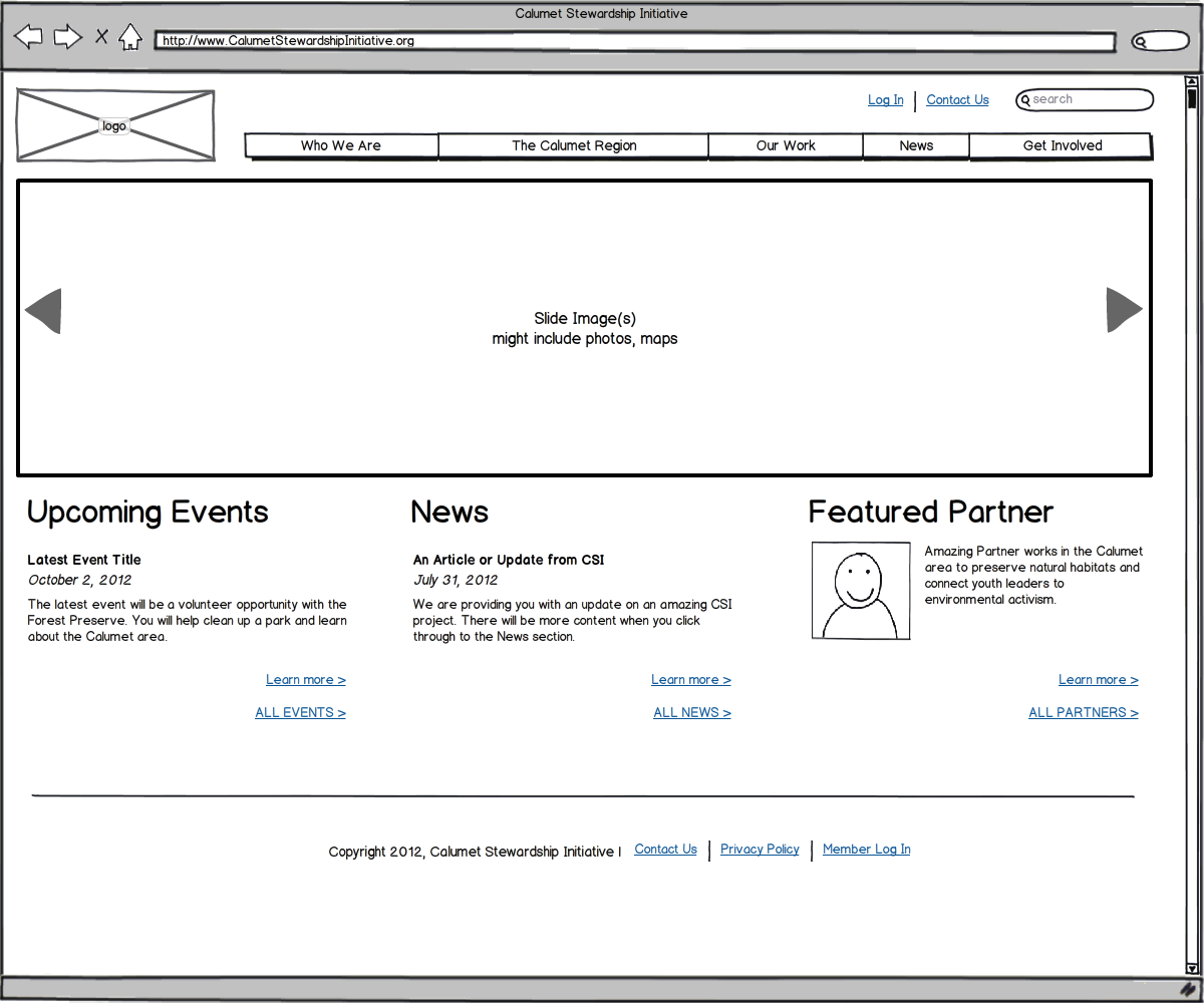
This is the Content area of your wireframe. There are many ways to arrange the content area, including the options displayed below. For your homepage wireframe, choose one area to serve as the main focus, especially for visitors who are new to your organization. Remember to use compelling pictures and images and to use the main area to introduce your mission or your community. Consider including areas such as: recent content such as “latest news”, links that take visitors deeper into the website and a call-to-action such as “sign up” or “donate”.
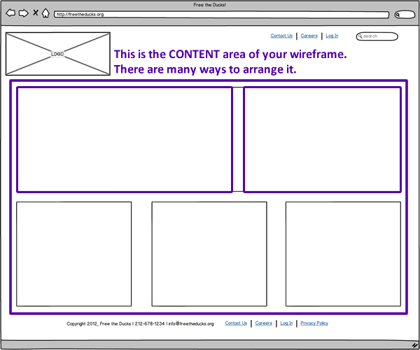
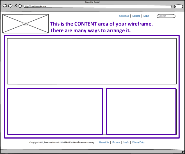
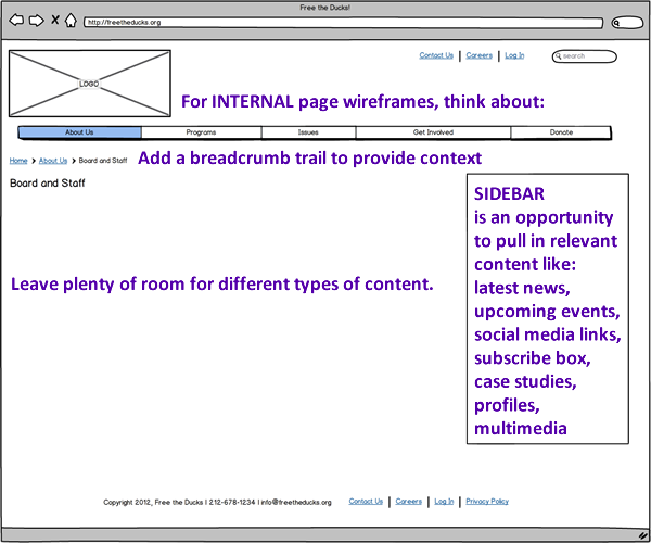
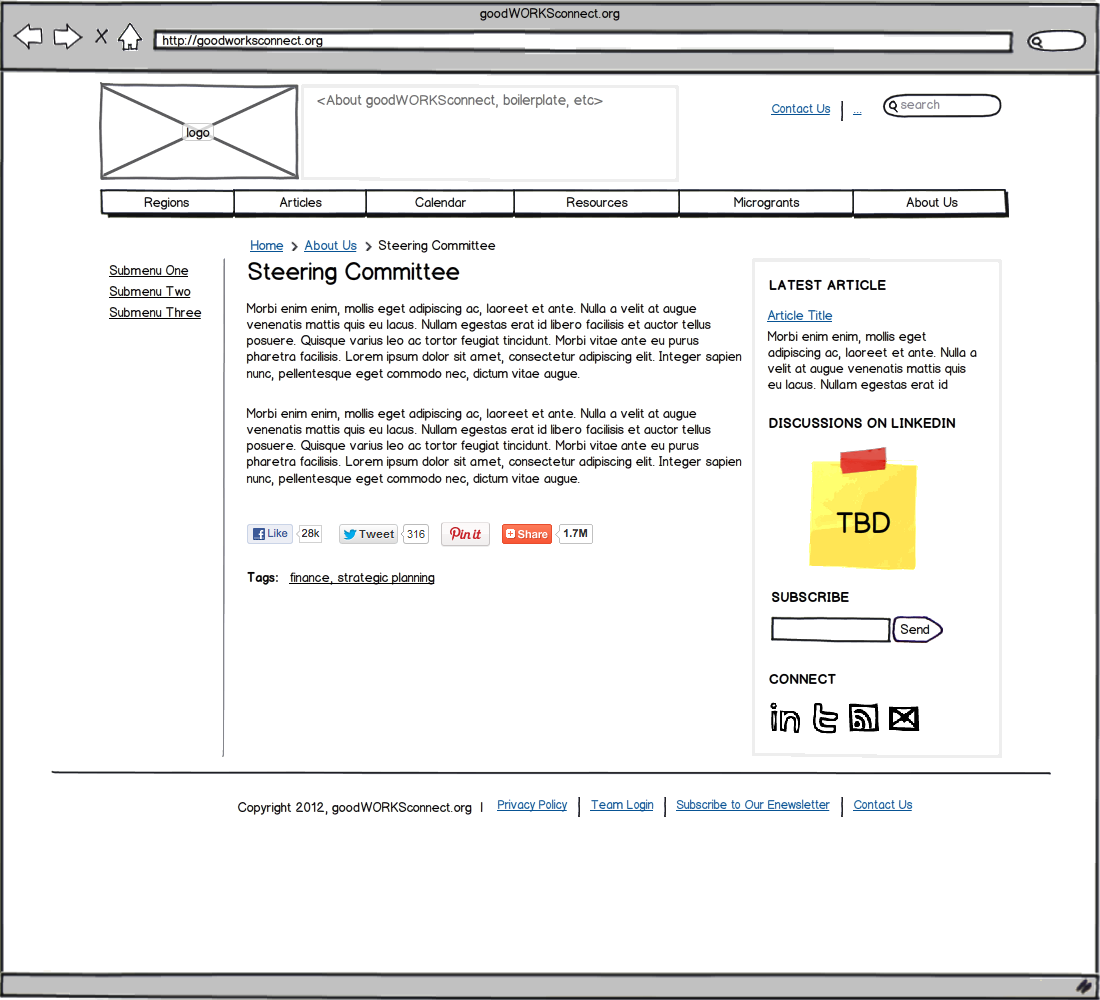
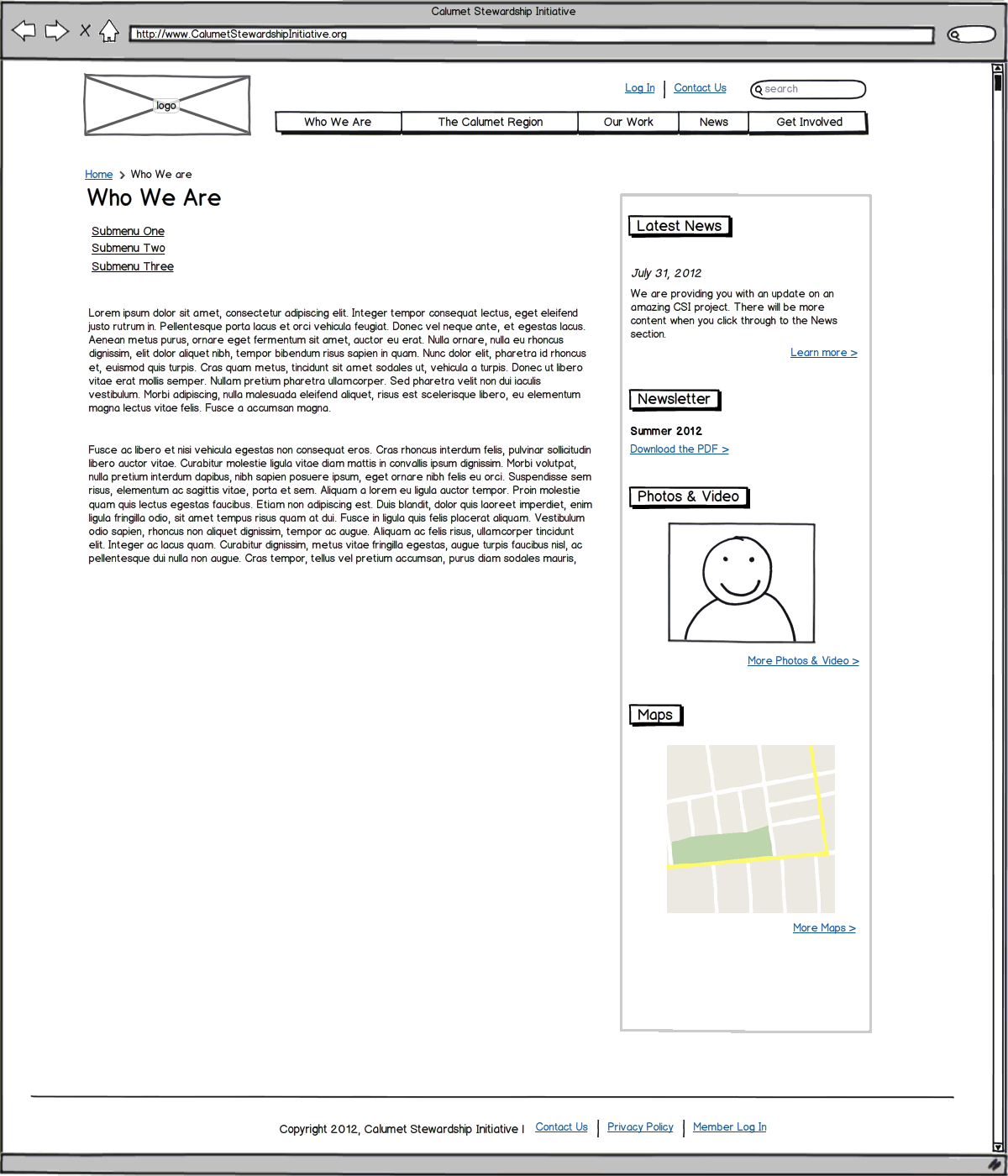
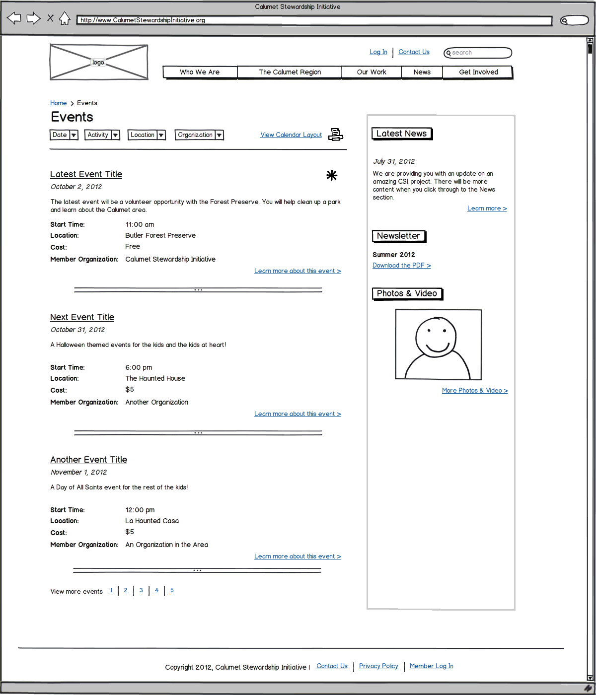
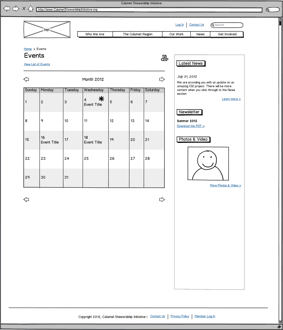
For internal page wireframes, think about adding a breadcrumb trail to provide context and remember to leave plenty of room to accommodate different types of content. The column that runs alongside the main content in the layout is called the sidebar. The sidebar is an opportunity to pull in relevant content such as latest news, upcoming events, social media links, a subscribe box, case studies, profiles or multimedia content.
Sample Wireframes for Inspiration
Below are homepage and internal page wireframes from two different website projects for review and inspiration. Click on any of them to view the full size image and review detail.

